Monday, 31 October 2011

Music Genre Research - Hip Hop


Hip hop is one of the music genres that is widely known all throughout
the world, and is very current in the 21st century. It is a musical genre that has become a culture and evolved so much it has subculture which consists of different stylistic music. Such as MCng/Rapping; this is where the artist says the lyrics commonly in a fast pace in time to a beat. Other styles include DJing/Scratching, Breakdancing and graffiti wall writing. It was culturally originated from the 1970’s in New York City when block parties became popular with African Americans and Latinos living within the Bronx. Not only Hip Hop but other music genres such as R&B (Rhythm and Blues), Reggae, Funk, Disco and Dub have all created the buzz around the Hip Hop subculture and made it emerge within the music scene.

DJ Clive Campbell also known as ‘DJ Kool Herc’ is known as being the father of Hip Hop. He is highly influential in the hip hop music and culture, as he moved to New York as the age of thirteen from living in Jamaica where he was born, he witnessed toasting, spoken work poetry which led to rapping and MCing and many other different music styles which he observed as a youth in Jamaica. He brought with him to New York his roots, skills and various techniques that have blueprinted the Hip Hop culture today.

For our music video the song we are focusing on is from the English singer and song writer Ed Sheeran. He is a diverse singer so the four genres which he typically focuses on are Hip Hop, Grime, Acoustic and Folk Rock. In some of his songs he mixes some of these four genres in one song to get more of a mass audience and appeal to other audiences of other genres.


In a hip hop music video, we see some typical codes and conventions. We notice codes such as non verbal communication like, sex appeal from every member of the video; particularly the females who are usually exploited.  We see the portrayal of money and wealth as a main and big factor, we see this in artist in the video throwing money around as if it’s nothing and they have so much its insignificant and not a worry. Flashy cars, diamond encrusted jewellery and half naked girls denote that the artists have all the things in life that they want and they couldn’t ask for more. This is all shown through fast pace cuts, extreme close up and high angle shots to make them look superior. 

(Click to PLAY video)


Thursday, 13 October 2011

Analysis of Magazine Advert (Rihanna)

Rihanna – Loud

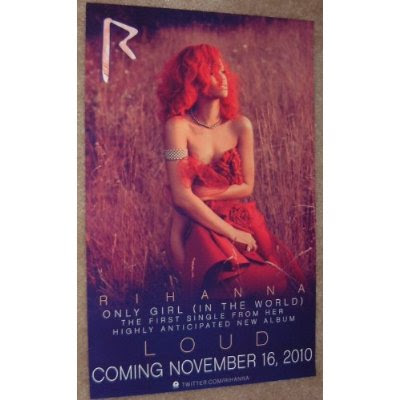
The last album cover I will be analyzing is Rihanna’s album cover called ‘Loud’. It’s a studio album that was released in 2010, by whom she is currently signed with Def Jam Records. One thing this album cover has in common with Lady Gaga’s cover is they’re strategy is similar as they both want to reveal nothing to their audience from the cover, they want their fans and the public to purchase it and let all be revealed. It’s also an extreme close-up of her face like Gaga’s Fame album, it simply says the name of the album at the bottom scattered and largely spaced.

Typically Rihanna also being similar to Gaga again in that they’re both confident and quite sexual, and flaunt their bodies a lot, in their albums the audience don’t get to see this side of them as we only see their face. We see her bright red hair and lipstick and she hides herself as she isn’t interacting with the audience by having her eyes closed, this creates enigmas within the audience as they begin to wonder what she may be hiding. Her face is the only part of her body we see and a glimpse of her shoulder as she begins to bring it up slightly as if an ‘innocent’ and shy girl.

On this cover we see a more subtle side of Rihanna as on her third studio album ‘Good Girl Gone Bad’ we see her rebelling and not conforming to the conventional diva style that young upcoming celebrity stars. She’s now more of a lady now as we see her wearing bright red lipstick, which suggests she has a seductive and sexy side to her; this is also conveyed through her lyrics, songs and pictures on her digipak and magazines. She is representing women in more of a post modern way, as their roles are more diverse now.

The main colours on the whole of the album are quite vibrant and but yet still soft. We see the primary colour of red in her hair, lips and roses. This makes Rihanna seem vulnerable and innocent compared to how she is depicted on the front cover. This image will appeal more to her target audience of young girls as she is being conveyed as feminine and beautiful. The red roses in the background that she’s lying in have connotations of passion.


We see a completely different side of Rihanna in this album as she posses a modern and formal style. We see her in a ballerina type dress and her hair style is very ‘Marilyn Monroe’, as it swoops across her face and is curled. Her persona is that of femme fatale, as although we see some slightly innocent sides of her, the public and everyone knows the real Rihanna and knows that the sexy, seductive diva will come out sooner or later.

Wednesday, 12 October 2011

Analysis of Album Cover Art (Lady Gaga)

Lady Gaga – The Fame

The first album cover I will be analyzing is Lady Gaga’s album cover called ‘The Fame’. It’s a contemporary record released in 2008 she is currently signed with Streamline Records. Lady Gaga’s album cover is an extreme close-up of her face with her name and the name of the album on the sunglasses she’s wearing.
This photo has a specific meaning to it as we only see little of her face as the big sunglasses block out her eyes and a hood covers the rest of her hair. We see she is ‘hiding’ her identity from the viewers which tells the audience that she wants to remain anonymous and reveal little, and they will only get a sense of who she is from her listening to the music in her album; this creates enigmas and questions for the audience.

Since Lady Gaga has came onto the music industry scene the public and world have welcomed and loved her, her crazy eccentric style and her pop dace music makes her the newer better Madonna! ‘The Fame’ album really speaks for itself; Gaga won many awards and it has become the first album that reached the platinum certification, after selling 300,000 units in the UK based on digital sales.

Gaga tries to make a statement with everything she does, so this album cover is pretty simple as everyone knows who Lady Gaga is, she doesn’t need to be extreme with her album cover; being herself is more than enough and exactly what the fans and public want.


Above is the Digipack for ‘The Fame’ album. Analyzing this will give me and my group more of an idea for what we want our digipack to be like. In Lady Gaga’s cover only shows her face for a reason. The glasses that she wears show that she is of high status and the diamonds on them signify wealth. The main factor we notice about our freak chic is that she is trying to make a statement with the less revealing image.

The typography throughout the pack is a simple, with block lettered sans serif font. This is because Lady Gaga wants the attention to be on her style and her pictures. The font is all in white because the backgrounds are dark colored so it makes reading the tracks and information easy to read. On every panel there is a picture of her and information is always on the other side so it does cover her and it shows her dress code. All the pictures on every panel are between extreme to medium long shots of Gaga, meaning that she wants her audience to see the emotion and her style. The genre that Gaga is mainly focused on is pop, dance and disco, this is conveyed in the colors which are quite dark but lively and loud. Her non verbal communication suggests that she’s quite sexual, as she poses her gesture and posture are showing her figure as she wears a tight patent cat suit.


The photo below is the advertisement photo used for promotional purposes, and to tell the public and her fans that this album is coming out, and the music that you've already been hearing and more will be on it.


Lyrics for 'Little Lady'


Casting Actors


As we're making our real and first music video we wanted it to look as real, believable and good as possible. We put up an advert on Star Now to get some a few little experienced actors, and to get them to audition and see if they would be suitable to play the roles needed in our music video.
We got some positive feedback and continue to still search for people who we think fit our specific roles perfectly. 


Our Production Logo

Wednesday, 5 October 2011

Target Audience Research


For our target audience we went around and asked a group of diverse people of different ages and both genders, whether they were into music videos and the typical genre of music videos they watch. 


Ed Sheeran the artist that we are focusing on, isn't very diverse as he only does a specific type of music, so his audience isn't mainstream. The primary audience that he appeals to is mostly young girls and women from 15-30. However, the secondary audience is females and males from 15-40. They are all in the socio-economic groups of C1, C2, D and E. This is because they're mostly all young and in the lower and middle classes. 


Because young people nowadays all have different tastes, we got a range of feedback as to what music videos people watch, and what type of genre they like, and also what source do they view these on YouTube, MTV etc. Our results are shown in the video below...